import numpy as np
import matplotlib.pyplot as plt
import pandas as pd
In [18]:
x = np.array([10,20,30,40,50,60,70,80,90])
x
Out[18]:
array([10, 20, 30, 40, 50, 60, 70, 80, 90])In [19]:
x_ = np.array(x[0:9:3])
x_
Out[19]:
array([10, 40, 70])In [23]:
np.linspace(0,10,5) # 5등분을 해준다. 실수형태의 시작과 끝값을 정해서 나눠준다.
plt.plot(x)
plt.show()

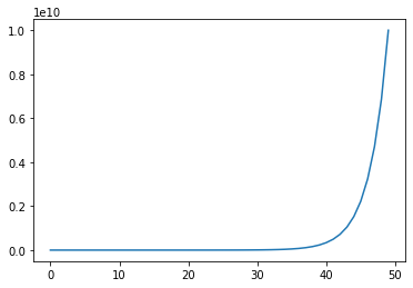
In [25]:
x_= np.logspace(2,10,50) # 로그 쪼개주는 함수
plt.plot(x_)
plt.show()
In [27]:
# seed를 사용하면 원래 사용했던게 같아진다.
np.random.seed(1)
result = np.random.randint(10,100,10)
np.random.seed(1)
result_1 = np.random.randint(10,100,10)
np.random.seed(2)
result_2 = np.random.randint(10,100,10)
result, result_1, result_2
Out[27]:
(array([47, 22, 82, 19, 85, 15, 89, 74, 26, 11]),
 array([47, 22, 82, 19, 85, 15, 89, 74, 26, 11]),
 array([50, 25, 82, 32, 53, 92, 85, 17, 44, 59]))
In [28]:
np.random.rand(10)
Out[28]:
array([0.20464863, 0.61927097, 0.29965467, 0.26682728, 0.62113383,
       0.52914209, 0.13457995, 0.51357812, 0.18443987, 0.78533515])
In [29]:
np.random.randn(10) # 표준편차가 1인 표준정규분포를 따르는 난수를 만든다.
Out[29]:
array([-0.0191305 ,  1.17500122, -0.74787095,  0.00902525, -0.87810789,
       -0.15643417,  0.25657045, -0.98877905, -0.33882197, -0.23618403])
In [33]:
r=np.random.randint(1,100,(3,4))# 1부터 100까지의 10개의 숫자를 랜덤하게 출력 100은 포함안된다.
r
Out[33]:
array([[91, 63, 84, 97],
       [44, 33, 27,  9],
       [77, 11, 41, 35]])
In [36]:
r=np.random.randint(1,100,(3,4))# 1부터 100까지의 10개의 숫자를 랜덤하게 출력 100은 포함안된다.

np.random.shuffle(r) # 셔플로 숫자 섞기
r
Out[36]:
array([[88, 23, 44, 53],
       [75, 73, 91, 92],
       [98, 19, 85, 91]])
In [37]:
a=[1,9,25,49]  # 제곱근
a_sqrt=np.sqrt(a)
a_sqrt
Out[37]:
array([1., 3., 5., 7.])In [39]:
a = [1,3,5,7,9] # 제곱
a_sq = np.square(a)
a_sq
Out[39]:
array([ 1, 9, 25, 49, 81], dtype=int32)In [40]:
np.exp(0) # e의 승을 나타냄
Out[40]:
1.0In [41]:
np.exp(4)
Out[41]:
54.598150033144236표준 정규분포 그래프
In [45]:
x = np.linspace(-5,5,101)
y = (1/np.sqrt(2*np.pi))*np.exp(-x**2/2)
plt.plot(x,y)
plt.xlabel("x")  # 표준 정규분포 함수이다.
plt.ylabel("y")
plt.show()

In [46]:
import scipy.stats as stats
In [51]:
y_ = stats.norm(0,1).pdf(x) # norm(평균, 표준편차)
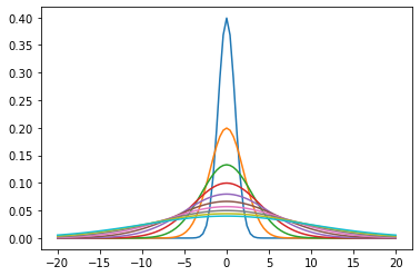
In [59]:
def norm(_a,_b,_x):
    return stats.norm(_a,_b).pdf(_x)
x= np.linspace(-20,20,101)
for i in range(1,11,1):
    _y = norm(0,i,x)
    plt.plot(x,_y)
plt.show()
히스토그램
In [77]:
x=np.random.randint(0,10,10) # 0부터 9까지임
plt.hist(x)
plt.hist(x, bins=30) # bins 개수에 맞춰서 나옴
Out[77]:
(array([1., 0., 0., 0., 0., 0., 2., 0., 0., 0., 0., 0., 3., 0., 0., 0., 0.,
        0., 0., 0., 0., 0., 0., 0., 3., 0., 0., 0., 0., 1.]),
 array([1.        , 1.16666667, 1.33333333, 1.5       , 1.66666667,
        1.83333333, 2.        , 2.16666667, 2.33333333, 2.5       ,
        2.66666667, 2.83333333, 3.        , 3.16666667, 3.33333333,
        3.5       , 3.66666667, 3.83333333, 4.        , 4.16666667,
        4.33333333, 4.5       , 4.66666667, 4.83333333, 5.        ,
        5.16666667, 5.33333333, 5.5       , 5.66666667, 5.83333333,
        6.        ]),
 <BarContainer object of 30 artists>)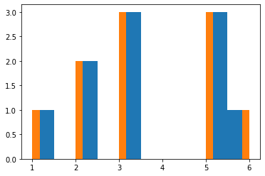
In [78]:
plt.hist(x, cumulative = True) # true는 누적이며 false는 기본이다.
Out[78]:
(array([ 1.,  1.,  3.,  3.,  6.,  6.,  6.,  6.,  9., 10.]),
 array([1. , 1.5, 2. , 2.5, 3. , 3.5, 4. , 4.5, 5. , 5.5, 6. ]),
 <BarContainer object of 10 artists>)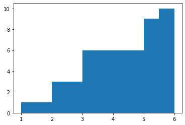
In [79]:
# 확률 분포
plt.hist(x, density = True)
Out[79]:
(array([0.2, 0. , 0.4, 0. , 0.6, 0. , 0. , 0. , 0.6, 0.2]),
 array([1. , 1.5, 2. , 2.5, 3. , 3.5, 4. , 4.5, 5. , 5.5, 6. ]),
 <BarContainer object of 10 artists>)
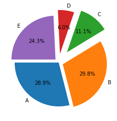
파이차트
In [97]:
x = np.random.randint(10,100,5)
labels = ["A", "B", "C", "D", "E"]
In [104]:
explodes =[0,0.10,0.30,0.20,0.10] # 차트 나눠서 표현
plt.pie(x, autopct='%.1f%%', labels=labels,  # 퍼센트 소수점 첫째자리까지 표시
        counterclock = True, startangle=180, explode=explodes)  # true 가 반시계 방향 , false가 시계방향
plt.show()
In [118]:
x = np.linspace(0,10,10)
y = np.random.rand(10)
In [127]:
plt.plot(x,y)
plt.xticks(np.arange(min(x),max(x)+1,1.0))
plt.yticks(np.arange(min(y),max(y)+0.1,0.1))
plt.xlabel("X")
plt.ylabel("Y")
plt.legend("X", loc=2)
plt.grid()
plt.show()

In [129]:
y = np.linspace(0,10,10)
x = np.random.rand(10)
x,y
Out[129]:
(array([0.74503826, 0.33966327, 0.65109219, 0.64111656, 0.22310262,
        0.75025327, 0.4540783 , 0.17564469, 0.25501423, 0.72563008]),
 array([ 0.        ,  1.11111111,  2.22222222,  3.33333333,  4.44444444,
         5.55555556,  6.66666667,  7.77777778,  8.88888889, 10.        ]))
In [136]:
# 수평 그래프
plt.barh(y,x)
plt.savefig("test.png", dpi=200, facecolor="blue")

728x90
'Python' 카테고리의 다른 글
| 가상환경 만들고 vsc 실행 하는 법 (0) | 2022.05.26 |
|---|---|
| yfinance 모듈 사용해보기 (0) | 2022.03.21 |
| 파이썬- 클래스 (0) | 2022.03.07 |
| sales 데이터로 group, datetime, numpy 학습하기 (0) | 2022.03.04 |
| 파이썬을 이용한 코로나 데이터-1 (0) | 2022.03.02 |